Pages

Sunday, August 21, 2016

12 Tags of 2016: August

I cannot believe we are over halfway through August. I am one of the moms who hates the school year.   Ugh, double ugh and blech.

The August 12 Tags of 2016 is really pretty and really fun to do. I am so happy with how the background turned out that I cannot wait to do it on a bigger project.

I started by using Pumice Stone and Shabby Shutters Distress Stains on the tag. I LOVE how it turned out. I used Creative Chemistry 103 to push myself past my ink colors combinations and I am enjoying the results.

The Dragonfly is cut and embossed using the Alterations die and embossing folder set and then I glittered the body and put iridescent foil on the wings.  The camera isn't capturing the foiled wings very well. 

The saying is an Idea-ology Small Talk Sticker cut into pieces.  
I love the added detail of the highly reflective Remanent Rubs Gilded Accents on the upper right and lower left corners.  In person these rub-ons are very highly reflective- much more than plain foil.
I am head-over-heels for this background. The combination of the colors (Pumice Stone and Shabby Shutters), the paper (Wallflower) and the Surfaces (Linen from Textile Surfaces and Burlap from Textured Surfaces) and Deco Sheets is really pretty and interesting to look at.
Almost time for the September Tag.....

Laters. 


Sunday, August 14, 2016

Creative Chemistry Day 3-Distress Collage Mediums & Textures

Texture Paste Coloring
As I write this I have completed the entire class except for the last challenge and I have to say this class is incredible.  Tim is always a great teacher, someone who is able to convey the information he wants to in a way that is easy to understand.  Creative Chemistry 101 was all about the basics of using inks, paints, stains and rubber stamps to make art while Creative Chemistry 102 built on those techniques.  Creative Chemistry 103 is definitely an advanced class that builds on 101 and 102 and never looks back. CC 103 does require 101 and 102 as prerequisites...in a previous post I mentioned you could probably take 103 as a stand alone class but at the time I didn't know that Tim doesn't allow that.  As the class progressed I have to say that I agree with him. You definitely need the basics before staring this class because he doesn't slow down and teach any basics but goes full speed ahead using new products and new techniques using old products. However, don't let that scare you, if you consider yourself a beginner stamper or mixed media artist take CC 101 and 102 and then dive in to 103.  The class comes with lifetime access and you can rewind the videos or even download them to your own computer and at $25 a class they are inexpensive.

So.....day 3 was all about Tim's various Texture & Collage Mediums and how they can be used in unconventional ways with the various Distress colorants. So. Much. Fun.
Layered Collage

Layered Collage is pretty standard technique but I found I got a lot of cool texture and interest with the simple addition of Collage medium and Distress Crayons.

Texture Paste Coloring
Paste Coloring utilizing Opaque Texture Medium is a very fun technique and I ended up making two very different tags using this technique. The one at the top of the blog post and the one above both use this technique.  So much texture.....I LOVE this technique.

Then we did an embossing technique with Texture Paste and BAM! I had fun.
Texture Paste Embossing 
Texture Paste Embossing
Texture Paste Embossing Technique gives a gorgeous metallic effect unparalleled by other embossing techniques and I couldn't stop making tags. I actually made more than this but decided I could stop photographing them.  This technique is a lot of fun to actually do- the embossing powder bubbles and melts in a really satisfying way.
Texture Paste Resist
Texture Paste Resist Technique. I LOVE this effect.  It doesn't photograph all that well- the photo just doesn't pick up all of the beautiful glossy texture-though it does show up pretty well on video.  That said, I didn't think I was going to be all that impressed as it is a sublet effect.  It makes a huge mess on the stencils and takes forever to dry and can't be dried with a heat tool- so I ended up leaving them overnight to dry. Then I made my sample and it wasn't pretty....or glossy or transparent like Tim's tag.   Hmmm...you know where this is going right? I don't even know what I used but it wasn't Transparent Glossy Texture Paste because that was still sealed right with the factory plastic seal. So....another huge mess and overnight dry time but this time... it was perfect. Such a feminine sublet but effective way to add texture to a project.

Distress Grit-Paste Grunge
Distress Grit-Paste Grunge.  I am not sure I am a grungy enough artist to use this paste in this way but it does look pretty darn cool. It also looks amazing as snow and I cannot wait to use it at Christmas.  

Day 3 done. So many fun techniques that I will definitely be suing over and over.

Follow me on Instagram DaneePKaps or Twitter @RainJellyBeans

Laters......
SaveSave

Wednesday, August 3, 2016

Creative Chemistry 103 Day 2

Ok friend....day 2 of Creative Chemistry 103. For more information on the class you can read my day 1 post here.  Today we drag out the Disress Paint and I have to say I love the effect of Distress Paint and Distress Ink and Stains together. The more opaque paint looks amazing with the sheer inks.
The tags:

 Distress Paint Resist Technique. OMG I am in love with this.  Again I followed Tim's color way and used that Rusty Hinge with the blues....ahhhhhhh smitten doesn't even begin to explain my feelings.


This is Distress Paint Lifting Technique. This is definitely one of those practice makes perfect techniques. Getting the colors to not have hard edges is difficult and takes practice.  My other two tags were pathetic with very defined lines between the colors that looked like a preschooler may have been involved. It isn't in my comfort level to use all these rainbow colors and I do love the way they look together so I am glad I pushed myself to follow the colors Tim's chose.

Distress Stain Rub Resist Technique. This comes from one of the 12 Tags of if you are interested in the directions to this...but that's on you cuz I'm too lazy to search for which one. 


Ooooohhhh how gorgeous. It is hard to see on the photo but this is covered in sparkly perfection. This Distress Luminous Mica Technique is this glitter lovers dream.
My final tag of day 2 is Distress Marker Spritzed Watercolor Technique.  I have all of the Distress Makers and the Spritzer and have a love/hate relationship with both.  When I get the makers to do what I want I love them....when they look like I scribbled on a paper and never even considered blending them- even when I have pilled the paper trying to blend them with water- I hate them. The spritzer I mostly hate because I could never get it to do anything...until this tag. It took 3 tags and 4 times rewinding and watching the video but look how pretty.  Like really really pretty.  This one will probably find its way back into my repertoire.

That's it for day 2.  Day 3 is posted so I best get into my messy MESSY studio, stumble to my desk (cuz there is stuff literally everywhere blocking my way) and sit my butt down and get inking.

Laters.


Creative Chemistry 103 Day 1

Tim Holtz started this summer out right by reintroducing his Creative Chemistry 101 and 102 as a lead in to the all new 103 class. With added material and several challenges, 101 and 102 were a lot of fun and so far 103 has been more than worth the wait.

I decided to just show the tags and save the chat until the end. If you want to read more about the class and where I get manila tags for 3 cents each, then read on my friend. Otherwise, here are a few photos of my class tags Day 1: 
Distress Ombre 
This first tag was made using a custom Ombre Distress Ink pad. While it looks like I used two colors I did in fact use 3...in any event I love the way this looks.
Distress Highlight Stamping Technique
The 2nd technique utilities the unique properties of Picket Fence Distress Ink which is a pigment ink that as Tim says "thinks it is a dye ink". I will admit I don't use this pad very often since it isn't all that vivid and in fact does act more like a dye than a pigment ink.  This technique uses the ink as the first layer with a second colorful layer off set above it to give a built-in highlight. This is not my favorite technique and honestly probably the last time I will use it..... but you never know.
Distress Off-Set Stamping Technique
Watercolor is all the rage right now, for good reason because of course it is gorgeous.  This technique starts out using "no line" stamping. Kristina Werner who is a very talented designer and artist demonstrates it often on her YouTube channel.  Distress- Inks, Markers, and Stains work beautifully to achieve a watercolor look. Don't know how to shade? I have learned a lot from watching Kristina and Sandy Allnock on YouTube.... and practice helps too.
Distress Washed Watercolor Technique
This tag uses Distress Markers and I think this is the first time I was able to get a blend I was happy with. I love the little splatters all over the clean white cardstock.

And finally....

Distress Micro Glaze Resist Technique
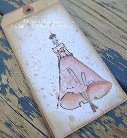
This gorgeous tag was made using Layering Stencils which add so much interest in only a few steps. Interesting codor combinations is something I struggle with...I find myself sticking to the same tried and true combos and Tim just goes for it. I admire that so much and decided I would follow his color combos to see if I could get out of my comfort zone. He goes for grunge and pushes it farther than I ever do but I love how this looks.  Honestly, I have never used Rusty Hinger before this tag and I am smitten where Rusty Hinge meets any blue. Like with my recent discovery of Aged Mahagony and Victorian Velvet (did you notice them on the dress above) I wonder where the hell have I been? 

Creative Chemistry 103 
You can learn more about the classes at Online Card Classes. This sounds like a commercial but honestly I have connection to Online Card Classes or Tim. I just love everything he does.

The class is only $25 with lifelong access. If messy-but super fun- Tim techniques aren't your thing, Online Card Classes do offer many other classes in a variety of techniques.  If you haven't taken any of Tim's classes before I highly recommend you check them out. I have learned so much and drastically changed the way I create using ink, paper, and paint. While the classes highlight the products under Tim's line with Ranger, many of the techniques can be used with other inks and paints. One of the downloads included in the class is a chart highlighting the properties of the various products made by Ranger but also includes a blank page for writing down your own experiments using other products.
Day 1 of 103 is all about Distress, highlighting the new Distress products Picket Fence Distress Ink, Distress Micro Glaze, and Distress Archival Inks. CC 103 build's on techniques taught in CC 101 and 102  and yet I think you could easily take the class as a stand alone class.  If you have never dragged a tag through a puddle of Distress Sprays you may have to watch the videos a few times to get it but none of the projects are particularly difficult to do. The art is getting the look you want without making mud..but it is only paper and tags are inexpensive enough that I never get upset if one ends up in the recycling bin.  Tim usually demos on #8 manila tags.  Ranger tags are 20 tags for $3.99 or 20 cents per tag.  I buy my tags in bulk from XpressTags which offer #8 manila tags $30.64/1000 or 3 cents per tag; $8.88/100 or 9 cents per tag.  XpressTags do have a dark hole reinforcer while the Ranger tags have a manila color reinforcer, but for 17 cents in saving I will deal with it.  XpressTags offers manila tags in 8 sizes from #1 to #8 as well as tags up to size #10 in a variety of colors including white. They also have metal, plastic, and Kraft ($23.08/1000). 


So that wraps up day 1. Come back tomorrow for Day 3.  Also follow me on Instagram daneepkaps. 
Laters....


Saturday, July 16, 2016

Creative Chemistry 102 Layering Stencils Challenge: Tag 3

This is the last finished tag that I made for Tim Holtz's Week 6 Layered Stencils Challenge for Creative Chemistry 102.  The challenge involved using two of Tim's techniques he went over this week involving his fun Layered Stencils. You can read my previous posts here and here see the previous 2 tags and descriptions of the supplies I used.
In addition to the manilla cardstock accent piece made using Embossing Through Stencils technique I added a piece of book page that was silk screened using a Heidi Swapp screen and Reactive Screen Ink and run through my Minc and foiled with pink ombre foil. I cut the book page so that the foil polka dots are gold and almost a white gold leaving the pink dots for another project.
The "hello" die was cut from cardstock that I foiled using the Minc and rose gold foil.  The cardstock was covered entirely with toner from my laser printer which allows me to foil it using any color I want and giving me a shiny sheet of foil for die cutting. Gilded Perfection.
I finished the tag with a piece of metallic embroidery floss tied in a simple knot.

Laters.....


Creative Chemistry 102 Layering Stencil Challenge 2

This delicate second tag was made using Spun Sugar Spray Stain on the tag for a quick background. I inked Antique Linen Distress Ink through the Industrial Layering Stencil using a round foam blending tool.  I stamped the Type stamp from the Newsprint and Type stamp and inked the edges of the tag using Ground Espresso Distress Ink.
single bloom from the Flower Garden stamp set was stamped using Distress Embossing Ink on Distress Watercolor Paper and embossed with using Ranger Platinum Embossing Ink. Using a water brush I painted the flower using Spun Sugar Distress Stain.  The flower and all the tags were dripped with large drops of water and dried using a heat gun.  I also sprayed the watercolor paper with Heidi Swapp Colorshine in Gold that I have decanted into a Distress Sprayer.  This is my favorite way to get gold splatters on to everything!
The second technique-Embossed Stencil Technique- was made using the same colors as before but using the Stripes stencil and Ranger Embossing Powder.
I layered the tag with little flags made from old book page that had been foiled using Heidi Swapp Minc and her Reactive Art Screen Ink and her polka dot art screen.  The tag was layered with a scrap of Walnut Stain Core'dinations Distress.  The word "celebrate" was cut using an Alterations Celebrations Words: Script die and a piece of copy paper run through my laserjet printer making a sheet of toner that had been foiled with the Heidi Swapp Minc and gold foil.
I topped this tag with a pretty seam binding bow and an Idea-ology Heart Charm, some Baubles and two Swarovski crystals.


Laters....

Friday, July 15, 2016

Creative Chemistry 102: Layering Stencil Challenge 1

Tim Holtz is rerunning Creative Chemistry 102 this summer as a lead up to his new class Creative Chemistry 103.  Creative Chemistry 101 and 102 profoundly changed the way I use inks and paint when I took them several years ago. I highly recommend the classes- they are inexpensive and you have lifetime access..

For this go-around Tim has added new weekly challenges using whatever combinations of the techniques from the class that he deems worthy. This week's challenge was to use two techniques from the class using his Layering Stencils.
I decided to play around with the Stencil Stamping Technique and Embossing Through Stencils.  I ended up playing around quite a bit with the Stencil Stamping Technique and I am thrilled with the results. Actually, I also made quite a few really fun background tags using Embossing Through Stencils as well.  I will admit that melding the two techniques was a challenge, but I love what I ended up with.

This first tag is truly for coffee lovers.  Coffee lovers and all those of you who realized that Victorian Velvet Distress Ink is PERFECTION.  Why didn't you tell me? I mean how could you let me go all these many years without realizing this?  I am honestly so confused. I know that I have blended, stained and sprayed that color many times but somehow I didn't understand the majestic perfection of this color before yesterday....I feel stupid.
I started by spraying the background with said Victorian Velvet Distress Stain Spray. After it was all nice and dry, I inked the coffee splatter from the Splatters Layering Stencil then using Vintage Photo Distress Ink. I added Black Soot Distress Ink and one of the stamps from the weird and wild script on one of the stamps from the Stamper's Anonymous Ledger set.  Using Tim's "Spritz and Flick" technique, I added water droplets all over everything on my tag and table. That was all dried using a heat tool and finally I added Ground Espresso Distress Ink around the edges

The second technique I used was the Embossed Layers Technique using the Honeycomb Layering Stencil, Spun Sugar and Walnut Stain Distress Inks and Ranger Clear Embossing Powder.  Using the Alterations Tea Time die, I cut the cup and saucer from that tag and 2 plain cups- one from plain Walnut Stain Core'dinations cardstock and one from a piece of cardstock that had been run through a laser printer giving me a page of plain toner which I then foiled using my Heidi Swapp Minc and Heidi Swapp Rose Gold Foil.   I inked the edges of the non-foiled cups and attached them to the tag using foam tape.
A simple book-page band was added cross the lower part of the tag for contrast. I used a glue pen to apply a thin line of glue on the top and bottom of the book page which I then foiled using a scrap of foil-simply press the foil, shiny-side up, on to the glue. The word "friends" from  the Alterations Handwritten Love die set was cut using a piece of copy paper  that had been foiled using the same technique as the cardstock.
The top of the tag was embellished with a Core'dinations Walnut Stain scrap cut into a simple flag and stapled into place using the Tiny Attacher. The word "good" was die cut from the foiled copy paper using individual Alterations Alphanumeric letter dies. The die cut words and letters were attached using Ranger Multi-medium Matte. 
Studio Calico wooden stars billow on the steam from the coffee cups and the tag is topped by a seam binding bow colored using both Victorian Velvet and Ground Espresso Distress Sprays.
I have 3 more completed tags and a bunch of fun backgrounds to share over the next several days so come back or follow me on Instagram (DaneePKaps).

Laters....

Wednesday, July 13, 2016

July 12 Tags of 2016

Ugh, this summer is flying by and as someone how hates the school year-I don't sleep well so early mornings are painful-I live for summer. But time marches forward.

Tim Holtz's July Tag was so fun to make. I actually made a few versions but today I will post my favorite.  I guess it all goes down from here?

As always I will show you Tim's tag:

This tag was so hard for me and then I ended up making so many. My biggest problem was lack of direction following skills. I started by watercoloring painting a bunch of imagines and not realizing that I had to cover the image with Tim's Distress Glaze and then cover the entire tag with a watered down Distress Ink wash. I will show you a version later that is a complete mess up because I ended up splattering lots of colors in the background and couldn't Glaze over it. 

This tag started out shaky, but ended so beautifully.  I painted the butterfly using Tim's Distress Inks and  let it dry, used the Distress Glaze.  I used a gold watercolor wash over the entire card then a layer or watered down Broken China Distress Ink.  I inked the entire tag and the edges with Vintage Photo Distress Ink and I love the effect the three colors gave-gold, blue, brown.  The Vintage Photo was applied using a Mini Blending Tool.  I dripped water on to the Distress Ink to get that perfect mottled look I can't live without.
The tag was finished with sentiments made using Tim's Alterations individual AlphaNurmeric dies to spell out "FLY FREE" and "forever" from the Handmade Love die set.  "forever" was cut from a piece of cardstock I printed completely black on a Laser Printer and then foiled using Heidi Swapp Minc, rose gold foil.  I adore the Minc and cannot live without foiling everything in site.  I have a lot of fun things to photograph and get on here and my Instagram.

I finished off the butterfly by adding a Idea-ology Pen Nib covered in copper metallic embroidery floss. 

If you aren't following me on Instagram why not? I post a lot of my projects there so come find me DaneePKaps. 

Laters.....