Pages

Monday, February 27, 2012

Quick Gift Bag MakeOver

I will begin with….a warning….a heads up….an apology…..the ribbons are a little out of control.  Like one's bangs when you just can't get to the salon.  Yes, the ribbons are covering the majority of the design and I'm sorry.   I did cut them shorter after my 13-year-old complained-they were for her friends so I figured her opinion counted.

I decided to post this project anyway because the design is somewhat irrelevant.  What I want you to take from this is how easy it is buy a cheap, plain bag and jazz it up with only a few minutes a minimal supplies. First the offensive picture:
I started with plain brown gift bags.  These have handles made from grosgrain ribbon but you could use a any variety of gift bag- those with twin handles would work just as well and even a plain brown shopping bag- the cheap kind- would work.  You could add handles made from ribbons or fold the top closed, staple it, and cover the staple with a bow.  There are so many ways to do this….  I bought the two bags at Target.  They originally had the pink grosgrain ribbon as a handle and threaded through to become a bow in the front.  I untied the bow portion and got rid of it…the ribbon was stiff and bent and ugly- you can see a piece of it still is a little wonky in the bottom bag on the far left of the bow.  I could ave ironed it or even steamed it I supposed but I love seam binding and the way it lays. I just think it makes a prettier bow for something like this.  

While the bag was folded flat I added a bunch of rub ons.  I like to cut them up to fit my project rather than use them as they come.  The rub ons I used are from Basic Grey.  They are from collections long since retired but are available by the gazillion on Ebay (I've posted 3 of my favorites here…I have them in white and black and I love and use both colors) .  Rub ons are perfect for those of us who have no drawing skills.  While it is true that you could use rubber stamps to achieve the same design, I like the opacity and sharp lines I get from rub ons.  To achieve anywhere near the same precision from rubber stamps requires the use of embossing powder- and yes I do that too.  In the end I choose to go the rub on route.  I love how quickly I can put achieve a beautiful design using rub ons; I prefer to cut them up, turn things around, flip it all up, and use only part but not all of the design.  If you have never used a rub on or if you have only used words give this technique a try...
play around...have fun.  If you make a mess or just don't like the end product... the bad news is rub ons  don't come off, but the good news is it is simple to cover your mistake.  Simply use a piece of cardstock to cover the offensive area and then act like you always intended to use cardstock on the piece and isn't it pretty?

I used stickers to write the names of the recipient and added some rhinestones to jazz it all up a bit.  You know I need glitter or rhinestones or something blingy before I called it "done".   The last thing I added was the aforementioned unruly ribbons.  I used 2 colors of pink seam binding and made big loopy sloppy bows with lots of tails.  As I mentioned the tails got a good trimming before the bags were taken to the party. 

Laters….

Friday, February 24, 2012

Fun Cards…..Day 7

I end my Tim-Holtz Homage with a very masculine birthday card.  This card will be submitted to the Paper Crafts Magazine Stamping Royalty contest.   I started with the green handwriting paper from the 7 Gypsies 6x6 paper pak Avignon.  I stamped the map from Tim Holtz's Air Travel  (Stampers Anonymous) using black Archival ink on cream cardstock.  The map was cut out close to the edges and layered on the card.  The airplane from Air Travel was stamped onto kraft paper using the same black Archival ink.  The airplane is attached using the foam tape it pop it off the page.  Finally I stamped the compass using Embossing Ink on kraft paper and embossed it with Zing Embossing Powder in Metallic Gold.  I used a big circle punch- I'm not sure what the size is.  The letters to spell "happy birthday" are old typewriter key stickers that I have had forever.  I used PopDots to pop them off the page like the airplane.  The finishing touch is the "spine" of Tim Holtz's Journeyman Tissue Tape which I won from Tim during his 12 Tags of Christmas contest.  Simply add a comment and he picks a random winner.  I won on my birthday!


This is the final card that I made this week.  I am sure I will be making more…it's been a long time since I made a bunch of cards and I forgot how much I like it.  I do have to start on my Chandelier for Sally Jean's Chandy-Ella class.  Everyone else has their frame done so I need to get going.  The techniques she taught for making the panels that cover the frame are amazing and I cannot wait to get started on that part of it.

Laters….

Thursday, February 23, 2012

Fun Cards….Day 6


Okay….so I LOVE everything Tim Holtz does, everything he makes, everything everything.  It is sad.  No he isn't my celebrity crush- that would be Justin…No NOT Bieber…Jeez that is gross!  No Justin Timberlake.  You know, the singer, actor, dancer?  The one who IS NOT engaged to Jessica Biel…he can't be…he is MINE.  I digress….

I love Tim's products but I usually don't make things that really look like his.  I decided to make a few cards that are in the Tim Holtz aesthetic.  Tim always makes tags so I made a tag.  The stamps are both his- the 2 men began as 3 men but I chopped the one off.  They were stamped with Embossing Distress Ink and black embossing powder as was the "enjoy the journey".  I started with a manilla tag, inked with Old Paper Distress Ink and attached the Pomegranate Polka Dots.  The fancy design in the middle is a rub on from Basic Grey.  I love to use rub ons but I usually cut them up and make them different than intended.   The tag was topped off with a half bow with Pomegranate seam binding, an Idea-olgy Trinket Pin and a "courageous" Muse Token.  

Tomorrow brings the final Tim Holtz card.
Laters….

Wednesday, February 22, 2012

Fun Cards…Day 5

The first of my 3 masculine, Tim Holtz cards is one of my favorites because I adore the colors.  Purple, tan, black…so pretty but so masculine as well.

This card started again with a piece of brown cardstock from one of Tim' Holtz's Idea-ology Paper Stash.  I inked the edges using Frayed Corduroy Distress Ink.  The polka dots were made the same way as the book page dots except I used a piece of Tim Holtz Paper Stash Resist that I sprayed with Pomegranate Glimmer Mist.  Both the polka dots and the seam binding were sprayed with the Pomegranate.  Because the Stash Resist is a kraft paper and the seam binding was white they came out looking different.  

After I added the polka dots to the card I stamped the large background stamp from the Stamper's Anonymous Steampunk Cling Mounted set.  It is a page from a technical book or something  I used Black Archival ink and the regular kraft paper.  The edges were distressed with a distress tool- I have one from Making Memories that came in a kit but Tim has one you can buy individually. I attached this piece using my sewing machine.  The word and are attached with foam tape. 

The butterflies are from the Pappilon set and the pointing finger  is from the Steampunk set.  I attached the butterflies using two Idea-ology small brads.  The final- but my favorite- embellishment is one of the Idea-ology Pen Nibs wrapped with the Pomegranate Glimmer Misted seam binding.
Tomorrow a cool Tag.

Laters…

Tuesday, February 21, 2012

Fun Cards…..Day 4

A few months ago I happened to be looking at a paper cake made by Janet Hopkins if I remember correctly.  How adorable ti was and I instantly wanted to make one.  Cakes are fun to embellish in real life so embellishing a paper cake has to be great fun.  A paper cake is more forgiving than one from flour and eggs and much easier to redo if tragedy strikes.  Even better than making a paper cake is embellishing a paper cake.  As I contemplated ideas I saw the rhinestone clusters (they are part of the Recollections brand from Michael's) and thought they would make perfect decorative "frosting" for my cake.  So I made that cake…and I was happy.  Happy Dance time!!!!  Since then I've made others, including gorgeous wedding cakes with clear rhinestones or pearls.  I also made a child's birthday card with blue and teal "frosting".  They are always fun and so easy to tailor to fit any occasion. 

This exuberant birthday card was made using paper and embellishments from Pink Paislee and The House of 3's Soiree Collection which is readily available although it has been retired from Pink Paislee. 
The entire collection is very eclectic.  There is no doubt there is a party going on.  The collection includes  


These are but a few of the papers in the collection but I wanted to show you how diverse they are.  You can see the entire  collection here

My card started with a base card made from a beautiful peach colored paper that is the back of the paper called "Diamonds".   I made the card into 6x6 in. because I am obsessed with this size and shape right now.  It is easy to with the 12x12 piece of paper I started with.  I love this paper in particular because of the tone-on-tone design work you can see in the upper right corner of my card.  I was careful and made sure to cut/fold the paper in a way that I could still see that design when the card was completed.  Of course I inked the edges…this time I used Spiced Marmalade Distress Ink.  Next, I tackled the sweet little cake table.  I started with a little wooden table that is part of the Soiree line.  You can see the wood cuts in the picture to the right.  There is also a smaller table  a tea pot, a pennant garland, an arrow and the pointing finger.  I knew I wanted to ink my table with the Distress Stain and I knew I wanted it vibrant.  Not always so easy to achieve with these type of wood cuts and ink.  In order to get the vibrant color I used Spiced Marmalade Distress Stain.  First 
put on a lot of stain, let it sit a moment, wiped off the excess with a paper towel and repeated this.  After the 3rd application of stain it wasn't getting any darker so this time I put the stain in heavily, and without wiping it off, I used a heat gun to dry it.  This left a much darker and more vibrant color as you can see in the finished project.  I applied Embossing Distress Ink to the entire piece and covered it with UTEE (Ultra-Think Embossing Enamel) and melted it using a heat gun.  When the first layer was hot and molten I applied the second layer of UTEE- no ink this time- and heated it.  Again I added more UTEE and let that melt.  Usually, after the 3rd application and melting of UTEE the result is a thick plastic finish that is divine.  I will be honest, when I melted my 3rd layer I was not happy with the results.  I had to heat it up until it was entirely molten and wipe the entire piece off so I could start over.   For some reason I had way too many little bubbles.  I suspect it was from overheating the UTEE.  To be honest (again) I have a habit of just holding the heat gun to the powder and letting it go rather than moving the gun around as directed.  I've burned my fair share of embossing powders.  After my second attempt the table looked great so I applied it to the card using Glossy Accents.  

Time to bake make the cake.  I'm sure you can see I just cut simple rectangles from Soiree card stock. This is the time you can play around and get the exact design or printing onto your layer.  My second layer says "BASH" which wasn't an accident.  I carefully chose the pattern/design of the first and third layers so it wouldn't clash with the rhinestones and the busy look of the 2nd layer.  When the layers were what I wanted I inked the edges with a coordinating Distress Ink- Peeled Paint, Spiced Marmalade and Worn Lipstick.  The rhinestone clusters were added after the cake was assembled.  

I had the cake and the party Pennants…I needed some gifts.  All of the sweet little packages were inked and some were attached using foam tape to add dimension.   I added flat-back pearls to the white-and-yellow polka dot package and the peach box.  Although it is hard to see in the photo, the little cupcake on the package that says "Soiree" was covered in white glitter.  Bows were added with peach-and-white kitchen Twine, white seam binding and blue seam binding.    

This card is full of texture and suprises and so much fun.  

Tomorrow I will show the first of three masculine Tim Holtz -inspired cards. 

Laters….

Monday, February 20, 2012

Cards….Day 3

I am not sure where I will be submit this card.  It could go into the Paper Crafts Magazine Stamping Royalty under the Love category or maybe not….maybe somewhere else. 
This card starts with the same Kraft card stock and again edges were inked using Vintage Photo Distress.  When the card was finished I ran a Ranger Adirondek Dabber in Silver around the edges.   I punched circles from vintage book pages and inked those as well.  Hint: run the circles though a Xyron Create-A-Sticker and ink them while they are still attached to the backing paper.  I love using circles like this to make a polka dot paper because the stickers add texture.  The harlequin stamp is one of Tim's for Stampers Anonymous.  The image was stamped on white card stock using Embossing Distress Ink and black embossing powder was added and heat set.  I inked the edges of the white card stock using Black Soot Distress.  I cut a small piece of red card stock from MME's Lost and Found collection and inked it using the Black Soot Distress.  The dress stamp is old and I have no who's image it is.  I have seen this particular image done by several companies.  It was stamped on kraft card stock using the same Embossing Distress and black embossing powder.  The seam binding started white and was sprayed with Santa Baby Glimmer Mist.  I sprayed Slate Glitter Mist into my hand and used scrunched it onto the red ribbon to darken it slightly.  I tied the ribbon on the waist of the dress in a simple knot.  The dress was attached using  pieces of foam tape to pop it off the page.  "Amore" was written using my favorite letters- Tim's Idea-olgy Alpha Parts.  The letters only come in black but take paint- especially the Ranger Adirondek Dabber paints.  I used my favorite Silver Dabber.


Come back tomorrow for my over-the-top birthday card.

Laters….

Sunday, February 19, 2012

Cards….Day 2

For my second card in the Hello catagory I made another doily card but instead of simple this one is full of texture and ephemera.
I began with the same Kraft card stock but used several colors of Distress Ink to darken it and add lots of texture.  I used Antique Linen, Tea Dye, and Vintage Photo inks.  I stamped the October Afternoon doilies, again in 2 sizes, using Embossing Distress Ink and clear embossing powder.  In the center of each doily I attached a self-adhesive, flat-back pearl.  The white seam binding was sprayed with Marshmallow Glitter Mist and dried using a heat gun while holding the ribbon all scrunched up. 
The dangles are a Tim Holtz Idea-ology Trinket Pin, a bird from the Adornment Charms, and a rectangle Fragment.  I attached a piece of vintage lace to the back of the Fragment using Glossy Accents.  The jump rings are Tim's as well.  I also added a small Swarovski crystal from my stash. 
The letters spelling "HELLO" or actually "hello" are die cut from Tim's Alterations Alphabetical die and vintage book paper.  Each letter was carefully inked using Vintage Photo and a Ranger Inkssentials Craft Nib.  I used foam tape behind the letters to pop them off the page. 

Tomorrow brings another card….

Laters...

Saturday, February 18, 2012

Fun Cards Day 1

I have decided to make some cards and enter some card contests and submit some for publication.  I have submitted a few cards in the past (as in the long ago past) and 3 of the 4 were published.  Why haven't I submitted since? I have no idea really.

Here is my first card:
I'm entering it in the Paper Crafts Magazine "Stamping Royalty" contest under the Hello category.  I made a simple card- Hello just seems like a simple category doesn't it?

The A2 size card is made from kraft card stock.  The edges were inked with Vintage Photo Distress Ink.  I stamped with 2 sizes doily stamp from October Afternoon with white pigment ink.  The flower is made using Tim Holtz Tissue.  This tissue has a very unique texture allowing it to hold it's crisp shape.  The center is a vintage button.  The blue seam binding was tied into a simple bow.  The small tag that reads "Hello" was made with a white card stock, the same doily stamp and white Radiant Pearls.  I stamped "Hello" using black Archival Ink and small alphabet stamps.  The edges were inked very lightly with Black Distress Ink just so it would show against the background.

Come back tomorrow I have several more cards to share.

Tuesday, February 14, 2012

Digital Valentines Go Hybrid

HAPPY VALENTINE'S DAY….
Back when I was feeling low and in bed, I went nuts playing with Photoshop creating digital Valentines.  Those little cards didn't just stay in my computer…oh no, they came out…
Add some embellishments….
and all of these…..
Became …

 I didn't get close ups but I added a small amount of glitter to the cards and ran it through my sewing machine to connect them.  I hung it all with another garland like the one on my mantle.   
I made these crayon-and-waxed paper hearts probably 15 years ago.  I simply store them in an envelope. They are such a pain to make- at least I found grating the crayons really difficult.  The directions for these were in Martha Stewart Magazine all those years ago- I see Martha's floating around Pinterest a lot.  These are hanging in the doorway between rooms.

Laters...

Monday, February 13, 2012

Valentine Lollies

Remember the fun prize ribbons I glued on to pink seam binding to make the coolest garland of my life?  Since I couldn't stop making those darned things I had a few left over so I turned them into lollies.  Relax, it is easy- just hot glue wooden skewers on the back.  I actually forgot I had them and then couldn't figure out what to do with them- the vase I wanted to put them in looked ridiculous.  While partaking in some MUCH needed grocery shopping today I came up my answers….Brach's Ice Cream Conversation Hearts.  They are exactly my CRAZY-PINK-&-PEACH-VALENTINE COLORS.  Seriously.  I grabbed 4 bags, poured them into two el cheapo vases ($1 store) that I always seem to find a use for.  Super cute.  If you chose to accept this assignment, I must WARN you…they smell H.I.D.I.O.U.S.  Like super gross…like don't buy these if you actually plan to eat them.
Laters….

Thursday, February 9, 2012

Valentine Garland and More

Today the sun was shining in all it's glory.  That means I was able to get some pictures of my Valentine decorations on my mantle.  The overall decorating scheme is still a work in progress- yes, I am aware Valentine's day is next Tuesday- but I wanted to share the CAUSE of my happy dance.

****PHOTOS WERE REMOVED FROM THIS POST FOR PUBLICATION.****
I took a ton of pictures…of each little prize ribbon…indulge me please….Happy Dance…..
The prize ribbons were made using Tim Holtz Alterations Paper Rosette and Mini Paper Rosette Sizzlit dies and paper from Kiss Me Printable Background Papers  by Rhonna Farrer and My Mind's Eye Lost and Found.  The "ribbon" streamer were hand cut from the same papers as well as vintage lace and the flags from Kiss ME Printables. The ribbons were decorated with ribbons, lace, book paper, rhinestones, glitter, and pearls.  As you probably have noted, I own a used a lot of the Kiss Me products.  I bought them in the bundle available here.

Gilded Stash Box
Originally, I planned to do the pink/red/white color scheme as I always do, but Rhonna threw a wrench in that plan by releasing Kiss Me in a peachy color.  After consideration, and because she taught me how to change the color scheme of .png and jpeg files) I decided to stay pink and changed every single element in the bundle to pink.  Then I dutifully printed everything out.  Thankfully, I saved the pink color schemes with it's peach counterpart because my decision would be soon tested again.  You see,  I received my monthly box from The Gilded Girls Stash Society and it was full of these peach items including some amazing tulle (hard to see but is in the top center of the picture), mesh ribbon and pompon trim.  Seriously?  The universe was conspiring against me and my pink.  Ok, Ok, I will go peach because I knew I HAD to use the peach tulle and probably the ribbon and trim.  I printed
Gilded Valentine Project
everything out in peach.  THEN I was thrown a curve ball AGAIN as I learned that Christy Tomlinson and those Gilded Girls (Shea and her mom Debbie) are teaching A Gilded Valentine (for more info or to sign up here) which is free to those of us in the Stash Society.  There will be three projects- you can see them here- one of them is this stunning heart…which means I better save all my supplies from the box.

Coffee Filter Flowers
All this back-and-forth brought me to a big decision:  to use it all.. yes indeed…to go with BOTH pink AND peach.  I think it looks great.
I loved the coffee-filter flowers with glitter I made at Christmas and had great dreams of them in 3 tones of pink for Valentines.  Then I had the great idea to flock them all.  Yeah…. problem?  The flocking is a pain to apply- it does't shake or sprinkle from the jar.  It comes out in big chunks meaning you have to take small amounts and rub them between your fingers, gently sprinkling it over the item.   This takes a lot of time especially to flock an item with as many edges as the flowers.  But the biggest problem it the flocking is so sheer that it would take layers…many many layers if I wanted to actually SEE the effect.  That is far too too much work for a holiday decoration that won't store well.  So I went with my friend Glitter.  Have you met her?  I'm in love…..

I used white, pink, and the darker one is actually an orange that closely matches the peach- a darker peach…it might be too dark…I'm not sure.. I don't love it…It defiantly didn't make me do the happy dance.   In the end I must say that I loved the silver glitter/tan filters at Christmas…I love the white filters/white glitter here.  The others….meh.  They may come down.

I made a second garland from the peach and pink Kiss Me papers using images cut using my Vagabond and Tim Holtz Alterations Mini Hearts, Tattered Florals, Mini Love Struck and Mini Tattered Florals as well as some music paper hearts from a Martha Stewart Punch.  That garland was draped along with the string of clear beaded lights and a pink-mylar heart garland I bought from Target a few years ago.

The image with the two birds is part of Rhonna's Kiss ME and I just love it.  I added sweet little blossoms made from gathering seam binding and adding a flat-back pearl center, glitter, ribbon and pearls.


 This is my final Valentine bottle.  I used one of the rosettes, an old lace label, and a tiny heart.   I wrapped the neck with small faux pearls.


More to come….

Laters…..

Wednesday, February 8, 2012

A Pretty Valentine

Have you ever had one of those days when everything you make brings on a happy dance?  When you are so happy with what came out of your fingers that you literally can't sleep because you are still doing the happy dance inside…and dreaming of what else you can make?  I had one of those days yesterday.

First I will share with you that my pain and illness issues are still rearing their ugly heads but today I went to see Dr. S- he deals with my EDS pain and does the prolotherapy that I love os much…well I do love it because it has given me my life back…taken the horrific headaches away.   I was just there a week ago, but I was tired of being stuck in bed awaiting the next chiropractor or PT appointment where I would be adjusted/manipulated/cracked and feel great for 24 hours... then back in bed.  None of my team, nor I, can figure out exactly what is going on.  I'm tired of it so I made a mad dash to see Dr. S and for once the usually sarcastic and hilarious man with spars with me during my painful prolo shots- who can tell the funniest most ridiculous story- was serious and thoughtful, and he really...really listened to me.  This is important because my symptoms right now are really odd, not common, bizarre.  As soon as I told him everything he smiled and said "I think I know what this is".  I got on the table and he pushed and prodded and hit exactly where it was hurting me…actually saying "there" before I even could confirm it.. you see good doctors can still use their ears and examine with their hands.  I'll spare you the details but I will say it involved cortisone, prolo and pain relief.  I know he is on to something.  So I am hopeful…


I didn't get any pictures of the items that actually made me do the happy dance but I do have one of the pretty little piece I made the other day… I love it.  I put it in a vintage "flower frog" and placed it on my mantel.  You will find that I decided to mix peach and pink together this year and I love it.  

Laters...

Tuesday, February 7, 2012

Kindergarten Valentines

My kindergartner has to take Valentines to school right?…so I was planning on getting something together this week so he had time to address the envelopes himself- as requested by his teacher.  That is until I read the newsletter Friday- which thankfully I read Friday... often I don't read it until the next Tuesday.  The newsletter informed me (yes it was supposed to be a reminder) they are doing a little Post Office as one of their "centers" and they were due Monday.  Yikes….and they needed envelopes.  I asked him if he cared if they were purchased or if I could make them and since he didn't care…I made them using Photoshop.

All brushes are from Rhonna Farrer
I admit it was hard to make a "boys" Valentine card.  Am I the only adult who vividly remembers the anguish of giving the right kid the right sentiment?  I didn't want to give the gross boy who picked his nose and had green teeth a card that said "I adore you" or girl that called me names a card telling her "I love you".  So, I assume a boy would have even more issues.  Or maybe a boy's mom does.  Anyway, I tried a couple different designs and asked him which he liked best.  He went with a Steampunk hot air balloon and a minimalist color palate of black, white, and a splash of red.  Obviously I wanted to add crystals and glitter- in fact I even went so far as to ask my daughter if she wanted to send HER friends cards this year…cuz if said "yes" there would be glitter and crystals flying everywhere.  Sadly, she turned me down….flat….with a "we don't give out Valentine's anymore".  Oh…so what age do we again find it OK to send Vanlentine cards to our frinds?  Twenties?  Thirties? When we have kids?

What did your kids send?  Did you make something fun for them to hand out?

Laters….

Monday, February 6, 2012

New Jewelry

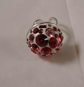
I am still playing with Crystal Clay and Swarovski Chatons.  I will be putting them up on my Etsy.
 This is a silver and red/pink square pendant. 
Taken with a flash- so sparkly.

 Love the round shape and pink crystals.

Beautiful white pearlized clay (white Pearl Ex added) and red and pink stones.
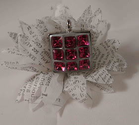
 I sat it in a pretty tissue flower to show a  better angle.

 This is silver clay, Pearl Ex and pink square stones in a square pendant.
Stunning red, white, and pink setting in silver clay (with Pearl Ex).

 Red, pink and white stones- including baguettes in Silver clay and Peal Ex.

 This sweet pendant has pink crystals on half. The other half 
left unadorned to show the beautiful clay and white pearl Ex.
I just received blue and purple stones…waiting for more ring blanks….look for these to come.
Laters...